 |
| esquire |
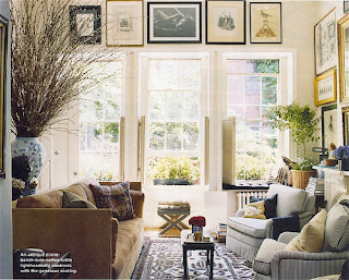
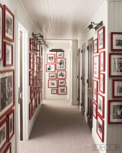
| I've been gathering inspirational images of framed collections lately for our new bathroom, which is now finally on the downward slope towards being completed. I think the trick to making this look work is continuity between the elements. 1. The idea of different sized frames in a small range of hues work really well together, and is a great way to display family photos. 2. Scale is also very important. I like the way larger framed pieces work together. Avoid going too small because your collection will look chaotic. 3. I'm not a matchy matchy person, so I also think varying between black and white, sepia, and color photos all work well together and contribute to the look of photos being collected over time. 4. The spacing between the frames is crucial. Too much can look random, and too little can look cramped. I like about 2 inches of space for 11" x 14" frames. I really love these pics below. The art has the feeling of being a continuously growing and added to gallery collection. I might have to implement it everywhere in our apartment, not just the bathroom! |
 |
| habituallychic |
 |
| marthastewart |
| elledecor |


